Thursday 31 January 2013

My Penguin Book cover design. thoughts on design and composition.


The first thing I wanted to do after reading the book was to get some imagery down on paper and do some more thorough research into book cover designs, methods, composition and basically find out what makes a good book cover design. I started by looking at the the previous penguin winners and studied their designs and the comments they recieved from the judges last year. After that I did some research on the curent submissions floating around on  the net, this involved trawling through a lot of students blogs to see what concept and ideas people had chosen to develop. 

There was a wide variety of different styles and takes on the novel. Some of the submissions were simple pencil illustrations that has been carefully developed to work in the template while others were complex designs with lots of layers and colours and things going on.

My graphics skills were, to put it lightly 'underdeveloped' last year and looking back on my submission for 'One Flew Over The Cuckoo's Nest' It was quite evident. embarrassed by my failures last year I was inspired to not let It happen again. I decided to take it upon myself to at least learn the basics, so starting in the summer break I got a graphics tablet, updated to a newer version of Photoshop and started teaching myself some new skills. I found it quite difficult at first but after a few Youtube tutorials and a bit of practice I started to improve.


With no digital experience at this time last year (I had one small digital based module with a tutor  called Andy at the beginning of first year)  I would not have had the skills or confidence to colour the image digitally: something that I attempted this time around. Another thing I noticed from my submission last year ( pictured above) was weak composition. The Barcode obscures a part of the illustration. Not a big deal but something that should not have happened. 


If you look at my submission for this years PDA (Above) the difference in rendering, colour and composition is quiet evident. After my research into the penguin design award and book composition I had a much better idea of what the judges would be looking for and how I could get the best out of these Ideas, my style and ability. Although there are some small things that could be tweaked I am generally very happy with my design this year. Also when looking at the two separate designs next to each other I am very pleased that I took It upon myself to take the digital side to Illustration more seriously. I feel that the digital rendering and textures help compliment my detailed and linier drawing style well.

The composition is much better and I think I put a lot more thought into the content as well as the design. I wanted to integrate the required text 'A Philip Marlowe Mystery' and 'Into by Ian Rankin' into the cover illustration and feel that I have achieved this quite well. I think that the text on the books in the foreground helps to catch the eye of the viewer and draws them in. The word 'Mystery' seems a little harder to read when compared to the others but that could easily be adjusted.


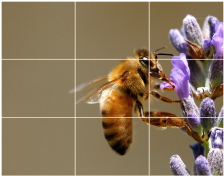
I did a little research and It turns out that there are a few basic rules of composition that always work. I remember learning about the rule of thirds as well as the golden spiral or ( fibonacci Sequence) and decided to refresh my old studies. We don't think about it too much but as we view images we are drawn to a particular direction depending on shapes and lines within the image. 

The rule of thirds divides an image into 9 boxes, 3 up and three across. This method of breaking an image up into three is much more successful than say cutting an image in half or into 4 parts. 


Equally important are the elements and their placement within the design. Elements are anything visual within the image, They can be illustrations, graphics, colours and text. As well as these elements there is something called negative space, negative space it the area where nothing is; basically the gaps between the images letters or colours. This negative space, If used cleverly can be a helpful tool but if left unconsidered, It can be detrimental to a design. Too little an a design can seem crowded, too much and you risk leaving your design looking sparse and unfinished.


Tuesday 29 January 2013

T-Shirt Desigers and Designers


SHEPARD FAIRY 


Shepard fairy really got started in 2009, with his first dedicated art exibitionentitles 'Supply and demand' where he exhibited an astonishing 250 works. He has a wide variety of media, including screen prints, stencils, stickers, rubylith illustrations, collages and works on wood, metal and canvas. Fairy is resposible for creating such famous works as 'Andre The Giant has a posse', Hope, and has produced art work for the following musicians:  The Black Eyes Peas, The Smashing Pumpkins, Led Zeppelin and Anthrax.


Shepard fairy's designs have become largely iconic in the last 10 years, so much so that he has been involved with legal issues sorounding the illegal use of some of his imagery with in the work of other new designers. His most famous is arguably the one above. These days you can achieve a very similar effect but putting an image through a specific photoshop filter. Cutout, or posterise I believe they are. The hope poster is one of a series of of posters created by Shepard in support of president Barack Obamas campaign in 2008.


The Interesting thing about the brand that he designs most exclusively for is that they are what you could describe as a anti-brand, brand. They challenge conformity, commercialisation, capitalism and other forms of injustice.


Fairey is the founding partner of the design studio BLK/MRKT Inc from 1997-2003, which specialised in guerrilla marketing. Shepard initially started doing his artwork for his skater friends but after a great response he saw the potential to create a cultural phenomenon. His style is often replicated or 'ripped-off' and like Bansky he has become somewhat of a household name.


Ray Frenden


I’m a self-taught illustrator with a penchant for monsters and the macabre.
Drawing from a childhood weaned on old horror comics, pulp fiction, and sci-fi, my brush and ink work hearkens to an older era. My sensibilities for line and footing in current color and design trends helps make my work unique.
At least, that’s what I tell myself.


There is not a great deal of information on this guy but I saw his designs and instantly loved them. He has a very strong but equally varied style. He has his designs created for a number of different mediums, namely T-Shirt design but also, skateboard decks, and magazines. I was particularly interested in his designs which make reference to pop culture, music, movies and cartoon characters. His style is more bold than mine with stronger lines but I can learn from his film related pieces. Also I noticed the composition is always just right.   


These few designs caught my eye. They relate to my T-Shirt designs as they are drawn in a portraiture style and have some additional elements, on to of the characters themselves.


The designs are focused around football players, amongst some of them are Eric Cantona, Paul Scholes and Wayne Rooney.


The design come from a football garment website called TShirtsUnited.com. The players feature all play or have played fot the premiership team Manchester United at some stage.


I like the simplicity of the designs, the dripping red pain on each design, the characterisation of the individual players and the scratch techniques used to give the T-Shirts a 'worn-in' look.


One thing I picked up on, more of an observation than a critic; but the players al have unusually long necks.


This last design is one of my favourite players, Eric Cantona, who played under the number 7 for manchester United for several years.


miscellaneous Designs

The following designs are more recent one's I picked off Threadless.com. There are a combination of funny ones some of which relate to T.V show and film Characters. (Reservoir Dogs and 'SWAG') They are all quite original and offer some form of humour, The 'Mummy' one and Baseball novelty hand man' are particularly funny.  

Play-matches-beautiful-tshirt-designs


Reservour-beautiful-tshirt-designs

Self-sufficient-beautiful-tshirt-designs


Swag-beautiful-tshirt-designs


Foam-monster-beautiful-tshirt-designs


Last Exit To Nowhere


Last exit to nowhere are a movie T-shirt company specialising in movie reference designs.